One account at a time was too limiting.
Many users wanted to see all their accounts together on the homepage.
Making the banking homepage more useful for everyday decisions: see multiple accounts, control what is visible, and reach key actions without hunting.

The brief was to redesign the banking homepage around feedback from people using the existing app. The work had to fit the group's established design standards and a defined project scope.
The product owner set out the scope, timeline and expectations in an onboarding meeting. From there, the design work focused on account visibility and the everyday tasks people expected to handle from the home screen.
The central design challenge was to improve clarity and control while retaining a coherent interface within the existing system.
User testing identified recurring needs that could be addressed within the redesign.
Many users wanted to see all their accounts together on the homepage.
Users wanted to hide balances and choose whether to show a transaction graph.
Account information needed a clearer hierarchy and larger type in key places.
The existing route through More → Sign out made a basic action harder to find.
The solution concentrated on visibility, legibility and choice, with each change kept within the system's visual rules.
The homepage was redesigned to show multiple accounts in one view, reducing the need to switch between accounts just to understand the overall picture. Double-currency views were also adjusted.
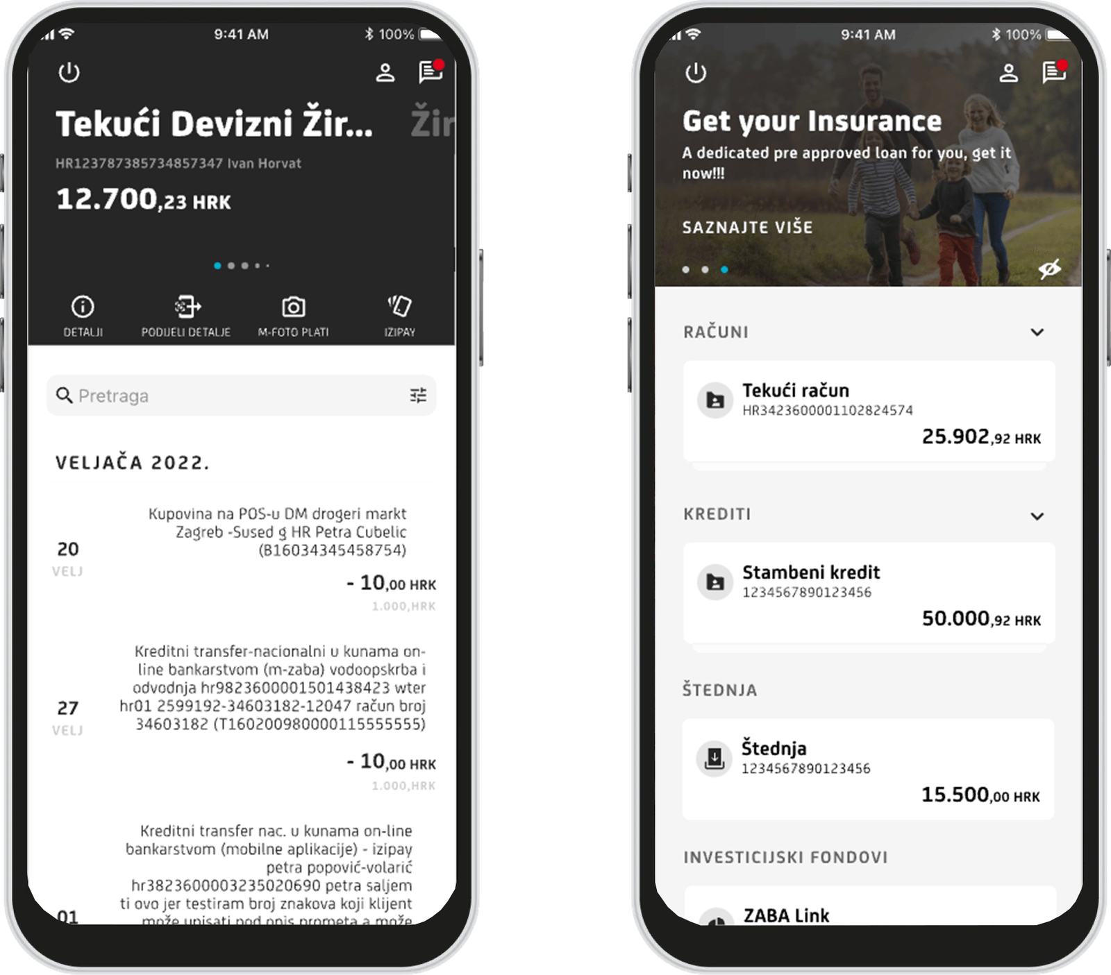
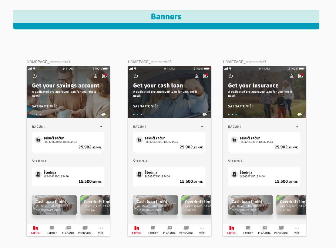
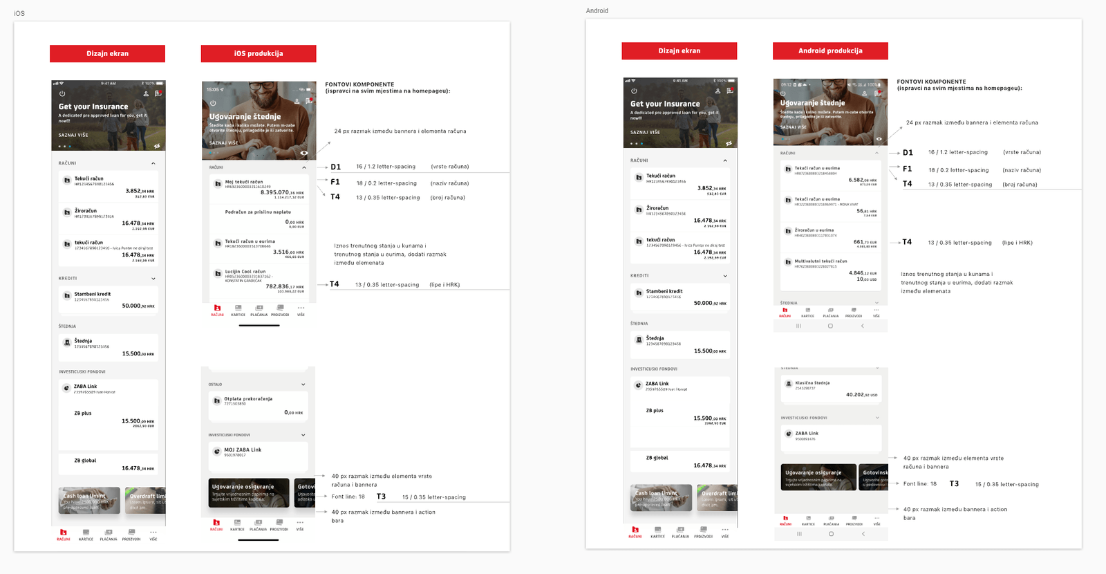
Account names and balances became more prominent within the permitted typography scale. Supporting details and transaction descriptions were resized to preserve a clean layout, including edge cases with longer content.
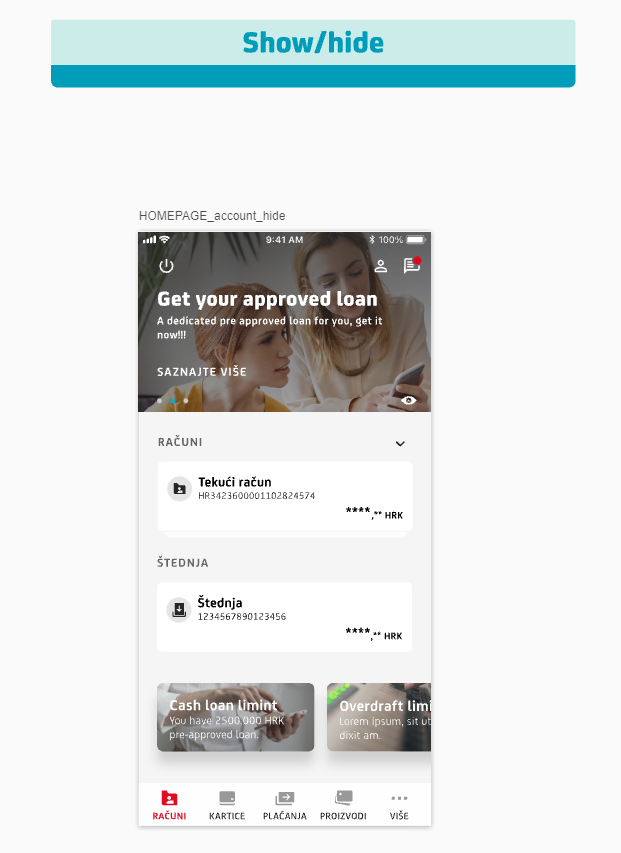
Balance visibility and the transaction graph became user choices. Graph controls were placed in options so the primary view stayed focused. A sign-out action was added to the homepage for clearer access.
3.2 → 4.7
Play Store rating after the redesign.The app’s Play Store rating increased from 3.2 to 4.7 after the design update. This was a key impact metric for the project.
The redesign addressed the usability issues surfaced in testing: multi-account visibility, display controls, clearer type and a more discoverable sign-out action.