Establish the system
Design principles, core visual rules, reusable components and decision guidance created a shared starting point for product work.
- Principles and UX guidance 01
- Colors, type, spacing and layout 02
- Components and decision trees 03
Building a shared product language from foundations and components through guidance that teams could use in practice.
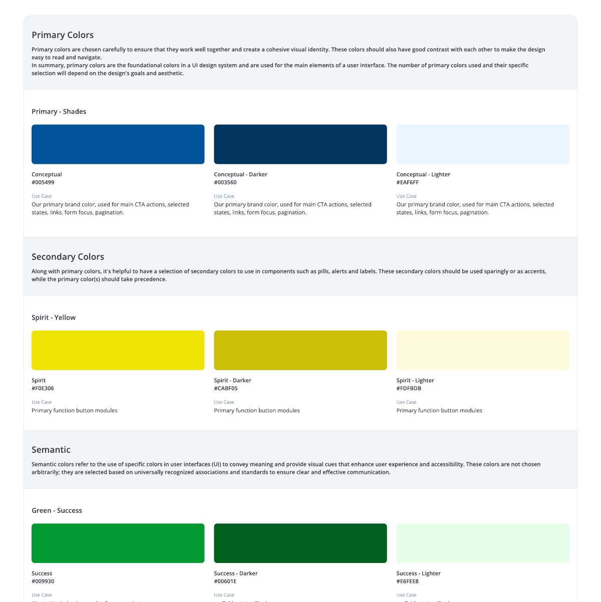
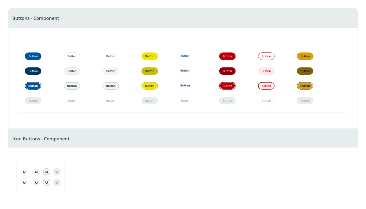
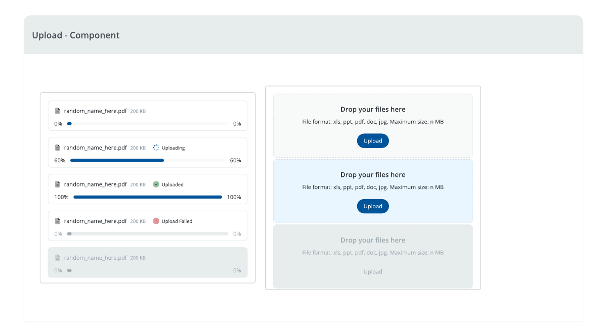
Without a dedicated UX setup, product teams had developed different ways of solving similar interface problems. Components varied between products, guidance was scattered, and implementation often depended on local interpretation.
My contribution spanned reusable components, visual foundations, usage rules and documentation. The system had to support existing products while giving future design and development a more consistent starting point.
The first release established the baseline. The second made the system more structured, discoverable and suitable for use across a larger organization.
V1 defined the language. V2 refined how people find, understand and apply it.
Design principles, core visual rules, reusable components and decision guidance created a shared starting point for product work.
The library was reorganized for a broader organization, with clearer component pages and a searchable place to consume the guidance.
The system connected the decisions that shape an interface with the assets and guidance needed to implement it.
Color, typography, spacing and layout anatomy.
Reusable patterns, variants and visible states.
When to use a pattern, with examples and decision support.
Accessible references for design and development teams.
The foundations define the visual vocabulary and the conditions for using it. Their value is in consistent decisions across different interfaces, not in the individual swatches or numbers alone.
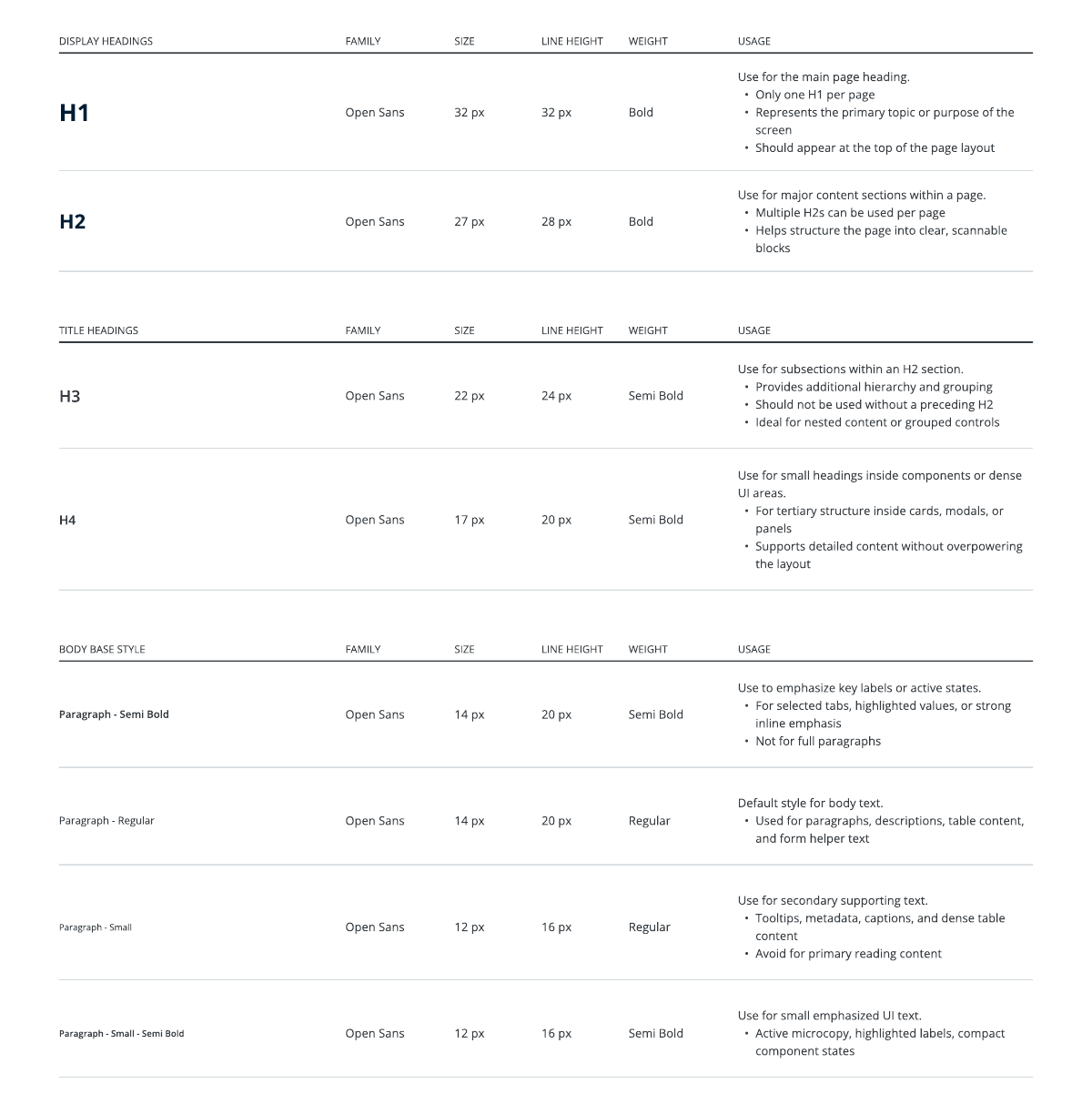
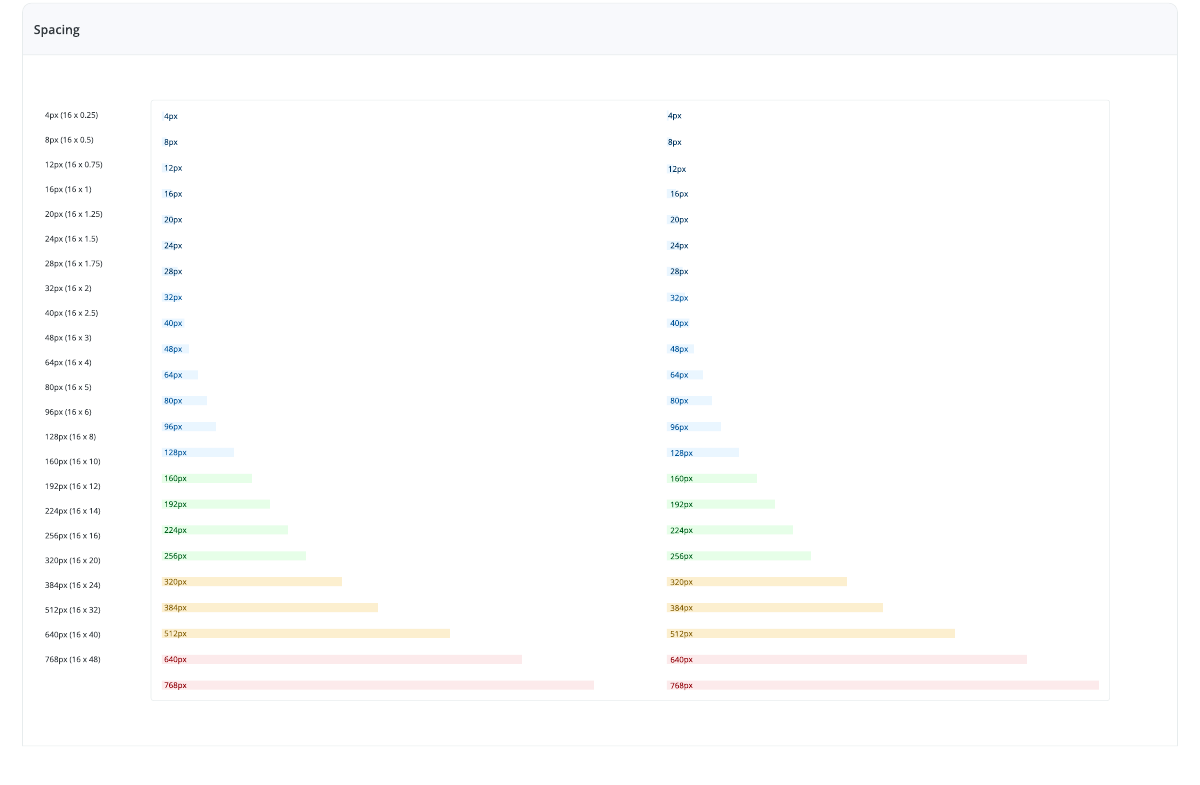
The component library captures variants and states for recurring interactions. Buttons show action hierarchy; upload patterns cover progress, completion and failure. The V2 guidance adds clearer rules for choosing and applying them.
The wider library also covers feedback and control patterns such as alerts, pagination, segments and loaders.
V2 brought guidance into a centralized, searchable ZeroHeight portal. Component pages gained clearer usage rules, examples and Do’s and Don’ts, alongside new accessibility and micro interaction sections.
Figma remained the collaborative source for editable design specs. ZeroHeight made the guidance easier to consume during implementation and onboarding.
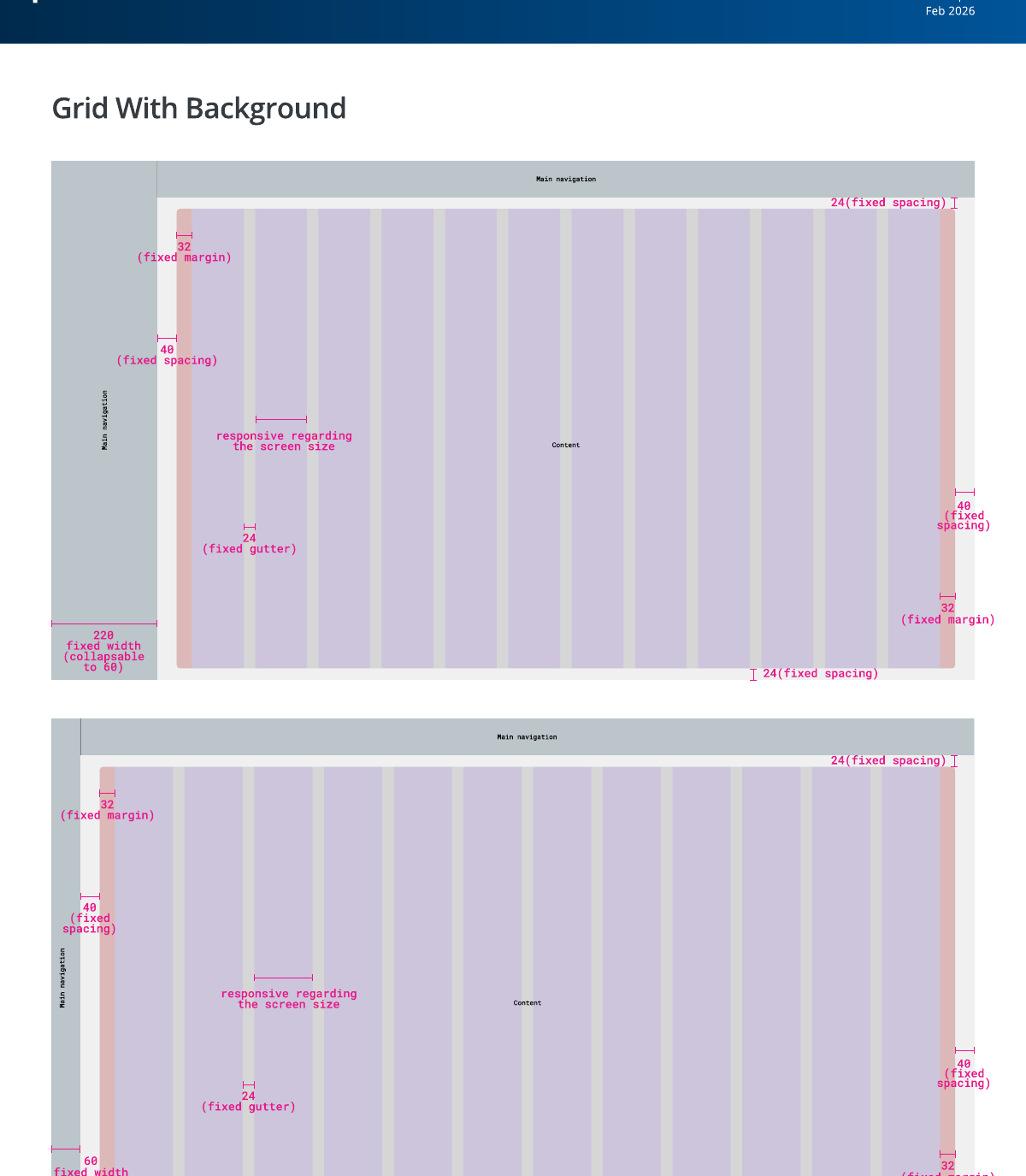
The work turned individual UI decisions into a system teams could reference, extend and implement.
V1 established a common foundation. V2 made its rules clearer and easier to discover, with more complete guidance for accessibility, component use and motion.
The durable design decision was to treat documentation as part of the system itself: components become more useful when the reasoning behind them is available at the moment of use.